Canonical
on 25 October 2013
Since we released the initial demo of Ubuntu on phones, we’ve been looking at refining the whole Suru theme — the theme on Ubuntu for phones and tablets — and creating visual guidelines for it.
Two of the things that we evolved were the treatment of the indented style and the corner size of the Ubuntu shape — the squircle. We wanted to make sure these were consistent across the theme so that any designer and developer could follow the same guidelines.
 The Ubuntu squircle shape
Explorations
There were lots of discussions about what kind of shadows we should use — blurred shadows, sharp shadows or a combination of the two — to represent the indented style, and we went through various iterations.
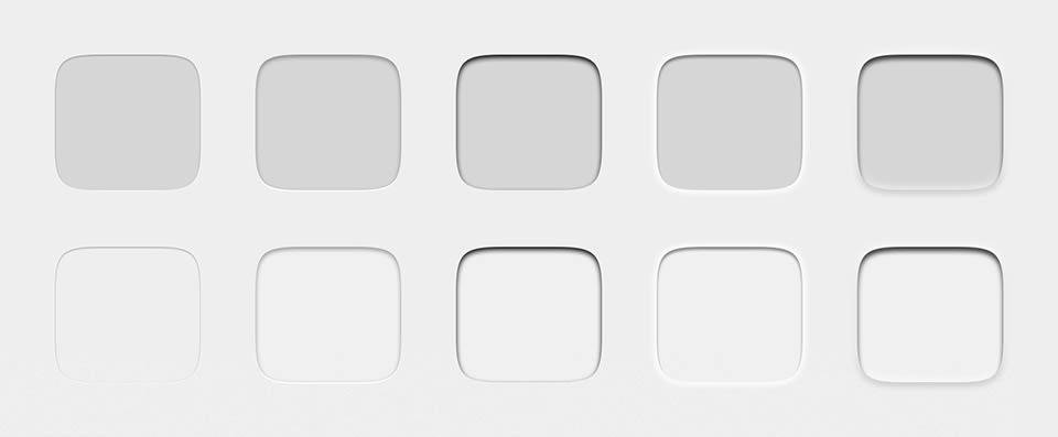 Variations on grey
Soon after we started looking into the indented style we decided to look at the corner size of the shape at the same time, as they work together. Since the squircle is not an ordinary shape, it can’t just be scaled up and down as needed, so we arrived at four different corner sizes that can be used in the different sizes necessary across the theme.
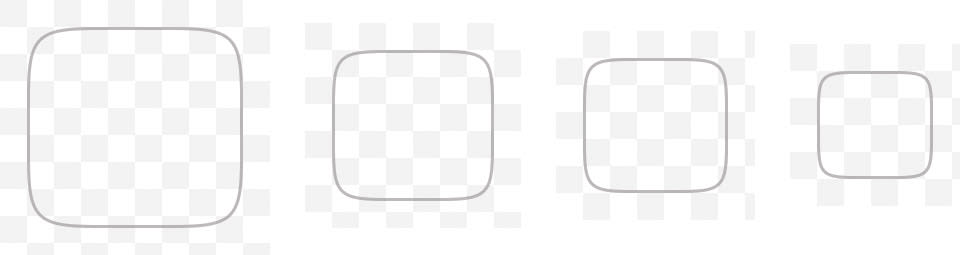 The four different corner sizes of the Ubuntu shape
One of the main goals for the shadows was to make sure they worked with different images inside the shape and on different backgrounds. We also needed to consider the pressed state of the shape, which has a bigger shadow inside.
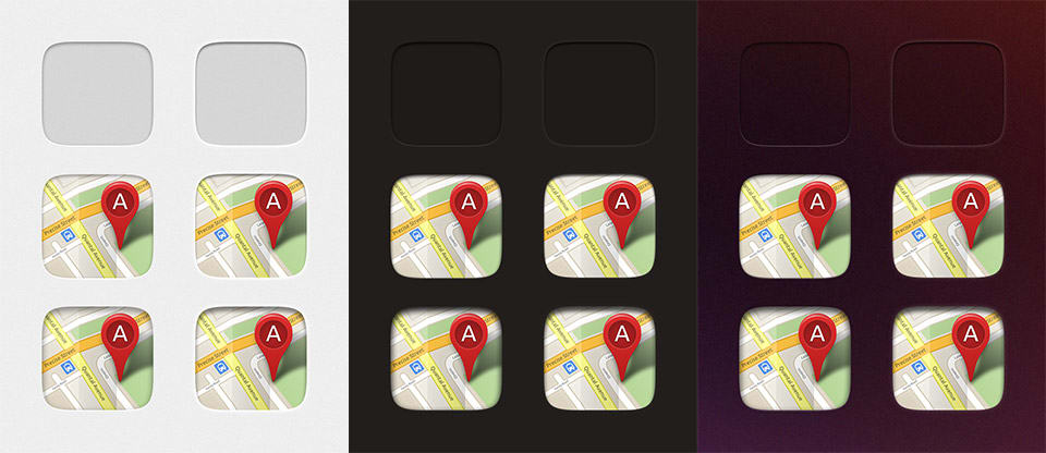 Variations of Maps icon on different backgrounds in the normal and pressed states
When the shape is used, it’s not always indented (like in popovers and notifications), so we also had to study these variations too.
Final styles
And finally after many iterations, discussions and reviews, here are the current styles of the indented and non-indented shapes.
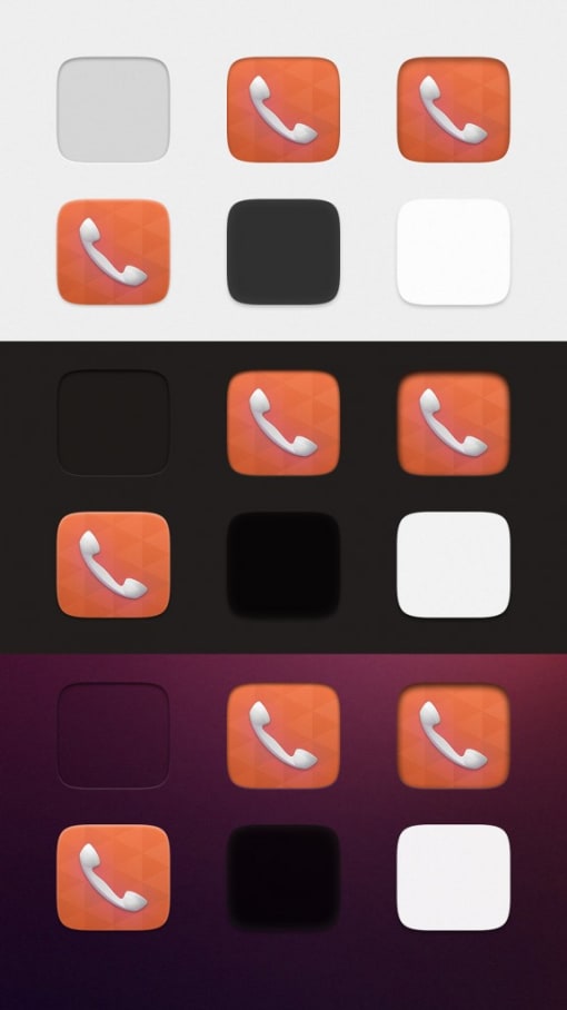 Telephony icon on different backgrounds
We’ve started to put these guidelines on design.ubuntu.com, where you can follow their evolution.